Tuesday 19 April 2016
Note to examiner
Hello examiner,
Whilst creating my magazine and over the course of the year, I have learnt new skills and improved the knowledge I had previously in order to produce my final product. I really enjoyed making this project and developing my knowledge at the same time and I really hope you enjoy my work.
Thankyou,
Elizabeth Tuft
Friday 25 March 2016


Thursday 24 March 2016


Wednesday 23 March 2016


Tuesday 22 March 2016
Tuesday 15 March 2016
Tuesday 9 February 2016
Feedback and evaluation from magazine draft
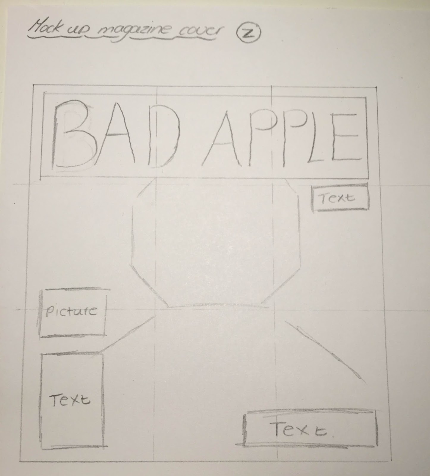
Magazine cover
Most people like my cover draft and felt like the image worked well alongside the colour scheme. However, a lot of people felt like I should re position the barcode, issue number and date as they are placed quite randomly. I agree with this and in my next attempt I am going to change it so that the barcode, issue number and date are placed out of the way and don't obstruct the main image. I also need to add the price next to them as I forgot to last time. My target audience also suggested that I make the text at the bottom of the page smaller so that it looks more sophisticated and professional as well as changing the font I used on the masthead so that it's more bold and fills the space.
Contents page
Whilst my target audience liked my contents page, they felt as though there was a lot of information on there which made it look really cluttered and overbearing. When I recreate this, I will look through what I have written and choose which articles I am going to use so that the page looks less cluttered and full.
Double page spread
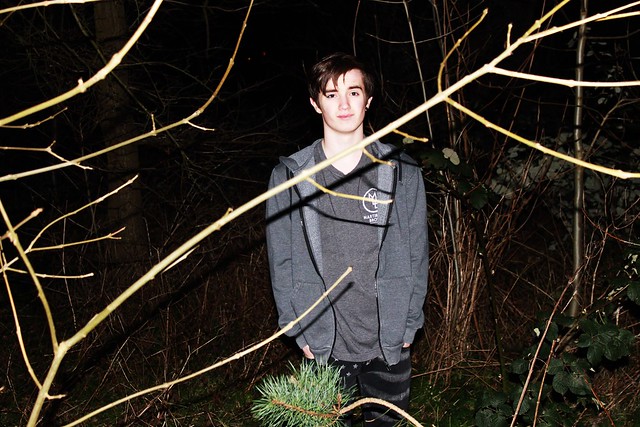
My target audience like the fact that my colour scheme was consistent even though it mainly uses black and white. They liked how I used the colour red throughout to highlight and make links to each page. According to them my article was very well written. My image was slightly off center which made it look slightly odd as the image takes up the entire page. Another audience member suggested that I should maybe retake the photo as they felt that the branch that frames my artists face was obstructing him. I order to improve, I will make it so that the image is more central to the page and i might try taking more test shots to see if I can recreate the image without the branch obstructing my artists face.
Overall, my audience felt like my chosen genre was shown through the images I used and the consistency of my chosen colour scheme throughout. To improve, I need to make sure that I include things like correct barcode placement and the magazines price and make sure that the text fills the space without looking untidy and cluttered. I also need to revisit my images and see if i can make them more central and clear.
Friday 5 February 2016


Thursday 4 February 2016
Draft - double page spread
Note: I have used a photo of myself in this draft, it will not be used in the real piece.

Friday 29 January 2016

Friday 22 January 2016
Thursday 21 January 2016
Audience feedback on pitch
From my audience feedback I
will make sure that I am more confident with my ideas in order to make them
stand out as my genre is unique. I will adhere to the genre but ensure that it
is done in an interesting, artistic way that makes it eye-catching to an
audience whilst communicating the genre effectively.
Monday 18 January 2016
25 word pitch
Pitch

My magazine is aimed at a both male and female audience between the ages of 15-25 who like indie rock and grunge music, fashion and information. My magazine cover will be quite loud and have a variety of colour in order to highlight certain parts such as the featured bands and the specialties included inside such as details of indie/grunge clothing companies like Nastygal and The Trash Rack. Whilst there will be elements of bright colours and loud graphics (similar to the ones used the covers on NME and Spin), there will also be a sense of class about it in order to adhere to the indie side of the genre. I have chosen this genre and audience to target as I feel that the genre has the potential to have a lot of variation and therefore allows for more experimentation and doesn't have to strict of a guideline to follow. It is also very popular within society currently and following the success of magazines such as NME, Q and Kerrang!, it would have a good chance at selling will and gaining popularity. Whilst the genre itself isn't prominent in the mainstream audience, the hipster trend of the 'underground', niche audience is popular and the fact that my audience is looking for certain fashion trends, music and informative articles on the featured bands makes it easier for me to market my magazine as it will showcase these factors to a niche audience.
25 words:
- Indie
- Unique
- Music
- fashion
- Quirky
- Confident
- Loud
- Contrasting
- Grunge
- 15 - 25
- Inspiring
- Off the wall
- Outlandish
- Bohemian
- Punk
- Experimental
- New age
- Niche
- Underground
- £3.99
- Variation
Thursday 14 January 2016

Wednesday 13 January 2016

Tuesday 12 January 2016
Friday 8 January 2016


Thursday 7 January 2016


Wednesday 6 January 2016
Tuesday 5 January 2016


Subscribe to:
Posts (Atom)